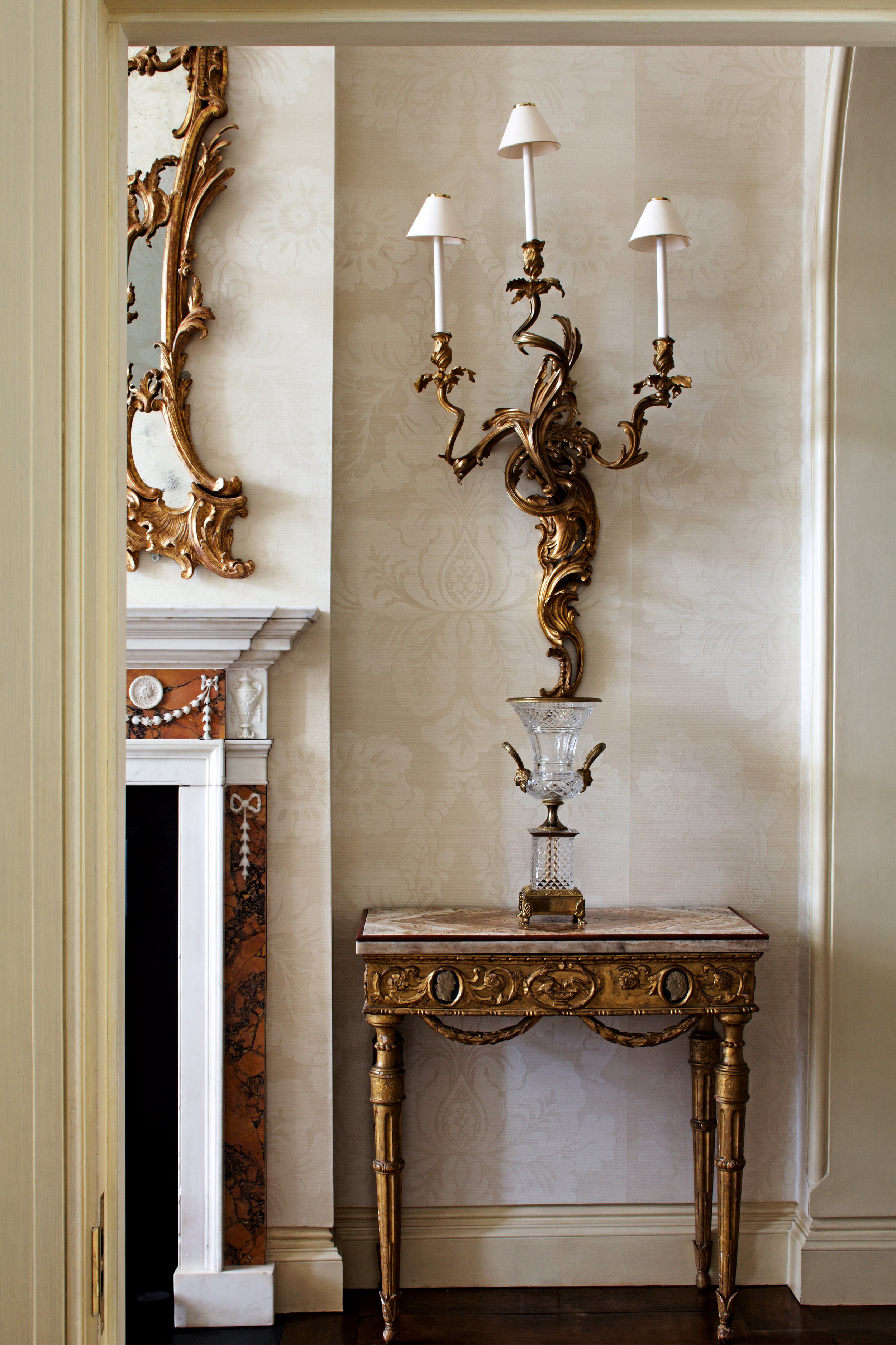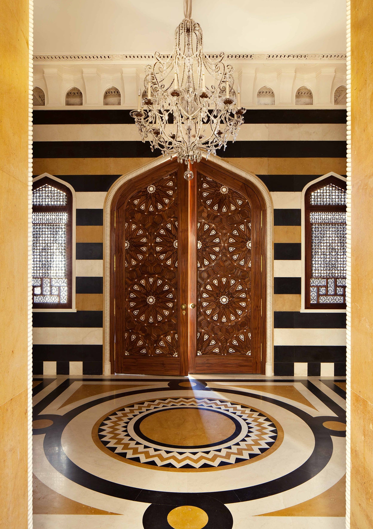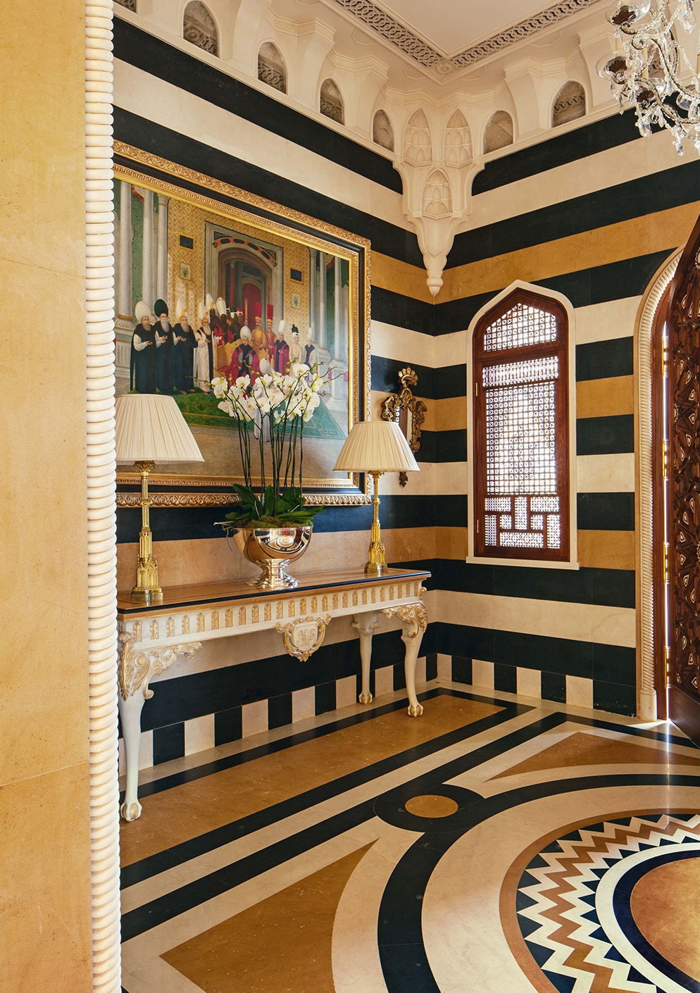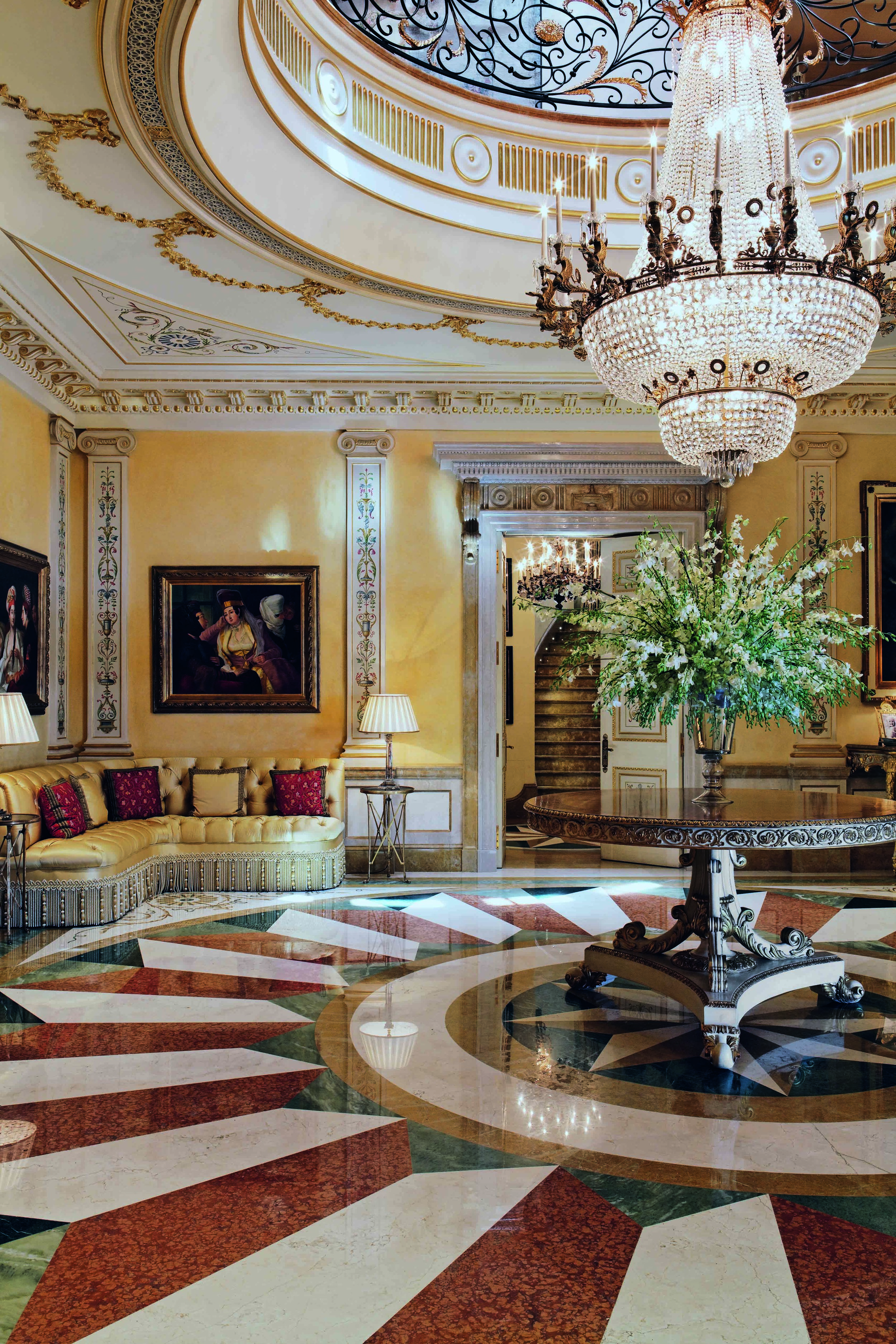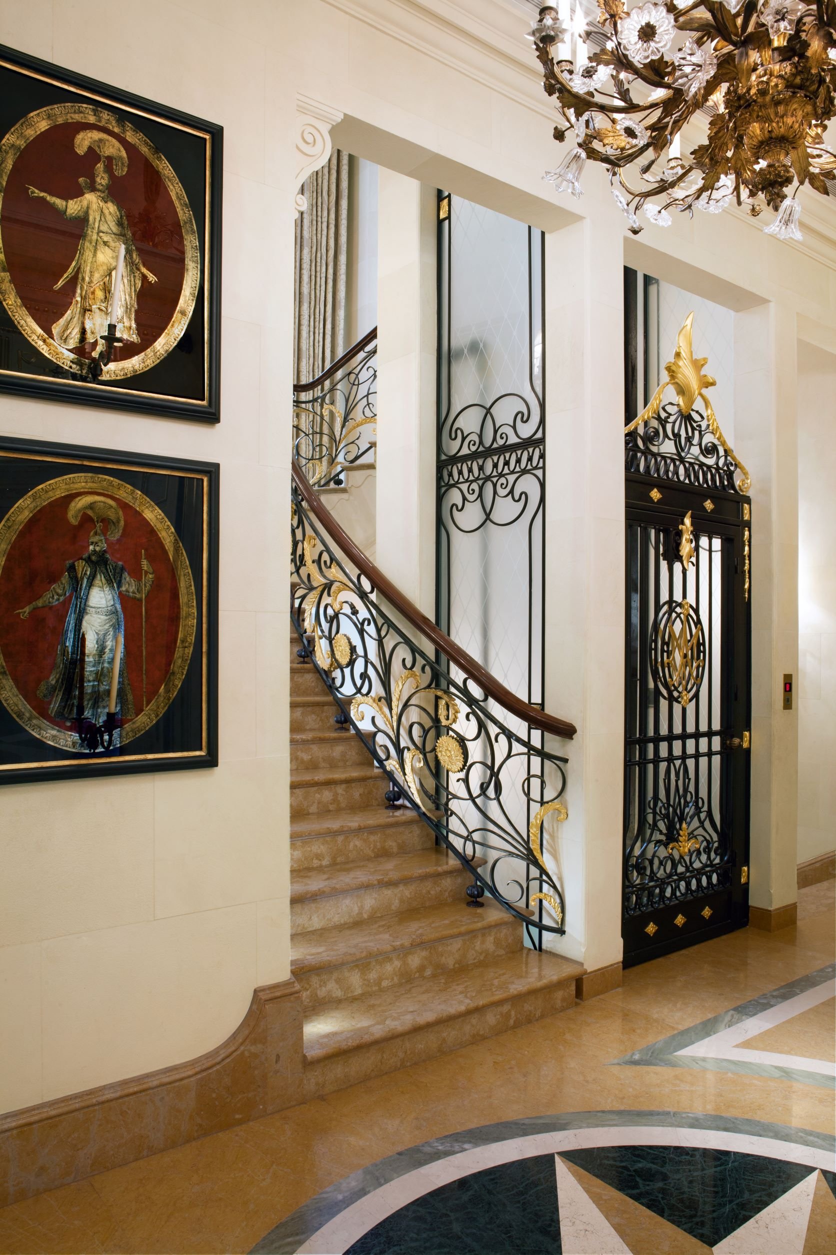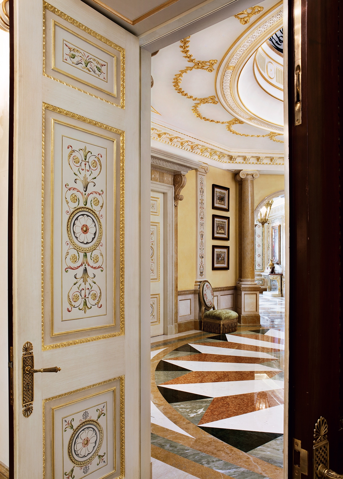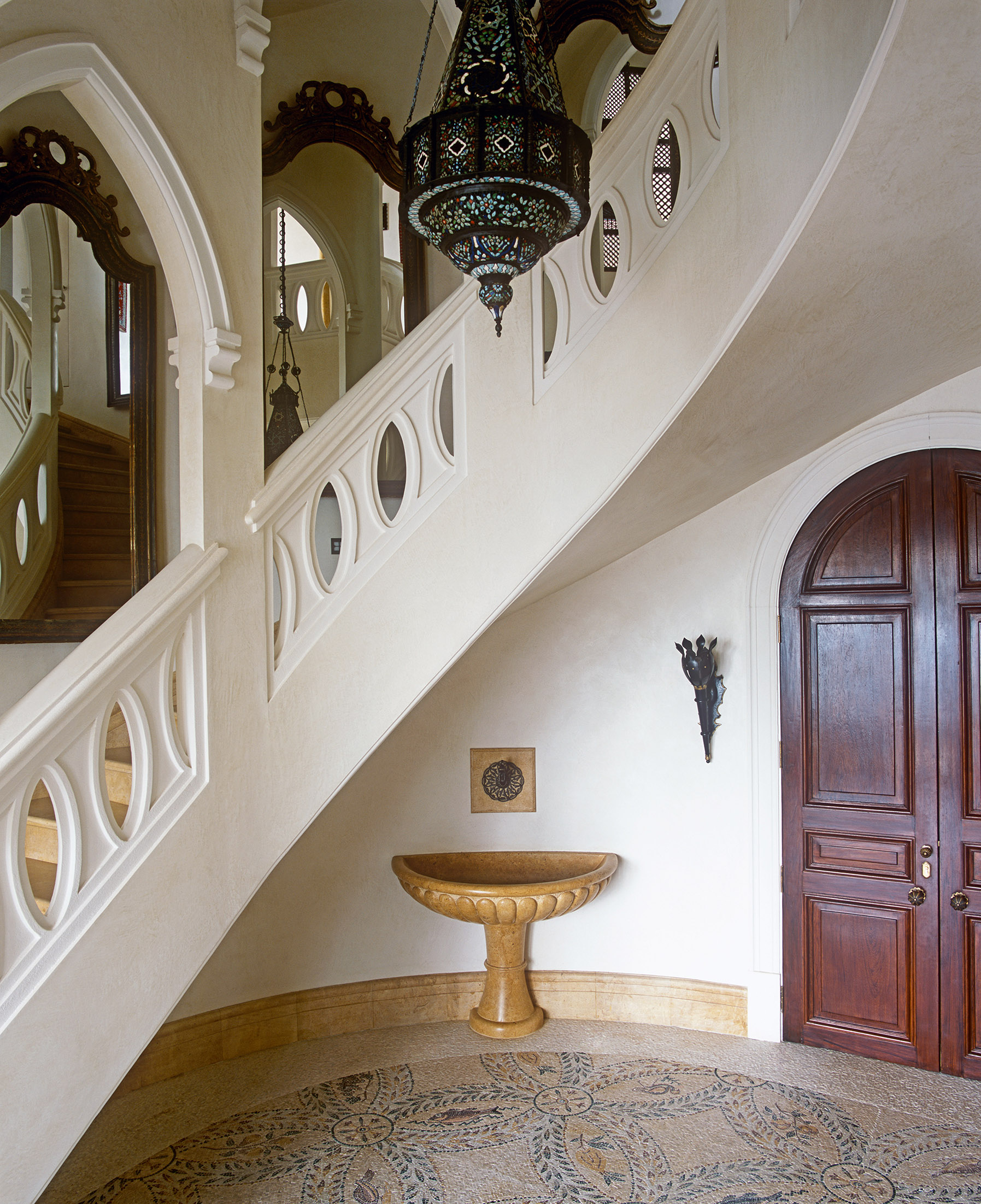
The design of the floor is fascinating in the way it works with the walls and surrounding decoration, as it gives the space its own internal flow and movement. All the marble has been antiqued to ensure it has no surface sheen, and where appropriate, there is the odd dink and bump to make the finish perfectly imperfect.

The up-scaled classical design in the marble floor increases the sense of grandeur and space. The fine detail on the paneled doors shown are very much part of the classical scheme throughout this home. Each panel has been hand-painted on canvas before being applied to the door. Wherever I can I will specify water gilding for moldings so I can acheive the right gold look.

My main aim was to produce a largely unfinished European-style hall that had clear classical references within the concrete shell that I was tasked with.


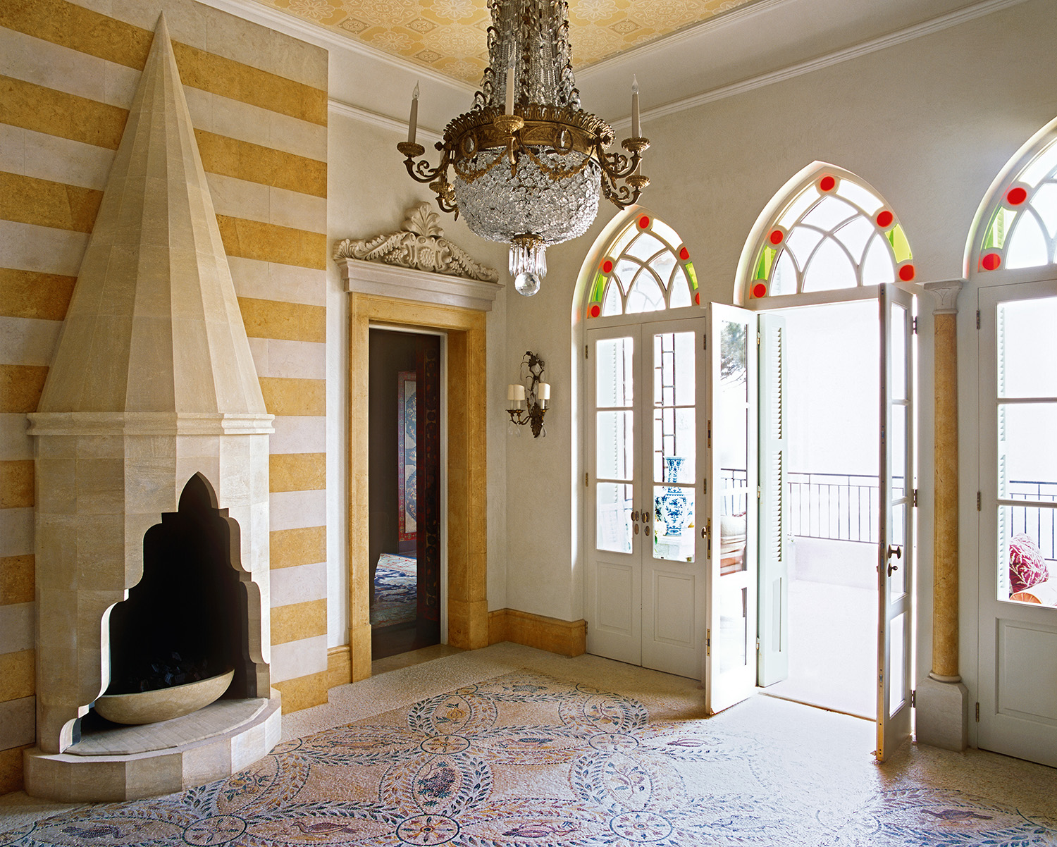
The entrance to this hall was built from an empty concrete shell. I allowed myself to go slightly overboard in terms of the scale and drama of the interior architecture in this hall, as it is the precursor to both the drawing and dining rooms.

This is a genuine hybrid design because there is that effortless mix of so many references, from the Roman style mosaic to the Ottoman style carved marble fireplace, with an example of local plasterwork above the doorway.

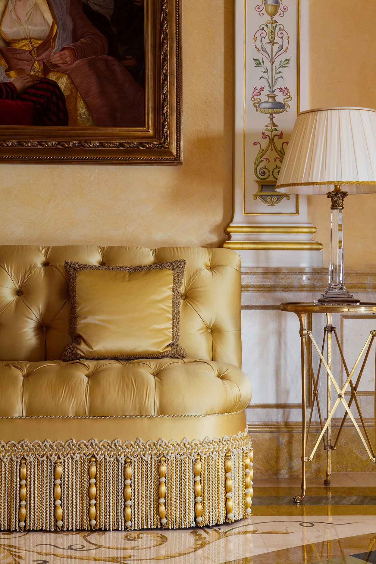
An intricately detailed silk-fringed sofa is one of the few pieces of furniture in the hall.

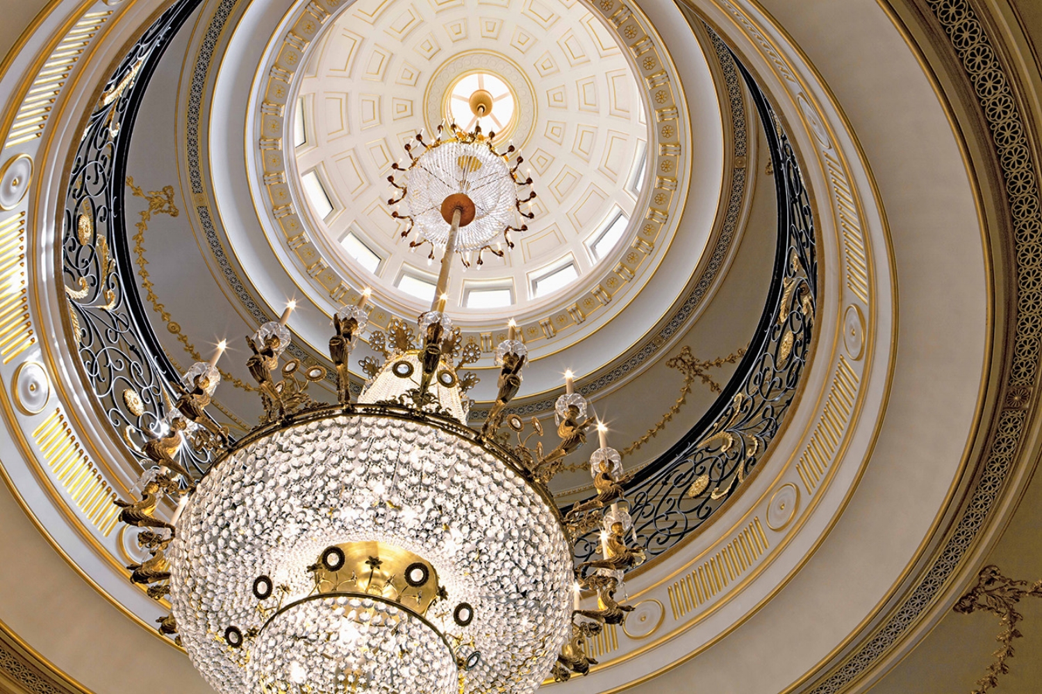
The wow is created by the pair of unmatched nineteenth-century crystal and ormolu chandeliers that are suspended from the cupula through two floors. After I found the two lights the fixing method presented a challenge since the combined weight of the two chandeliers was in excess of 300 kilos (661lbs). Specialists reconfigured the central sections of the lights so one could hang from the other. The finished result gives views through, up and around the area as a whole that fascinate and intrigue the eye.

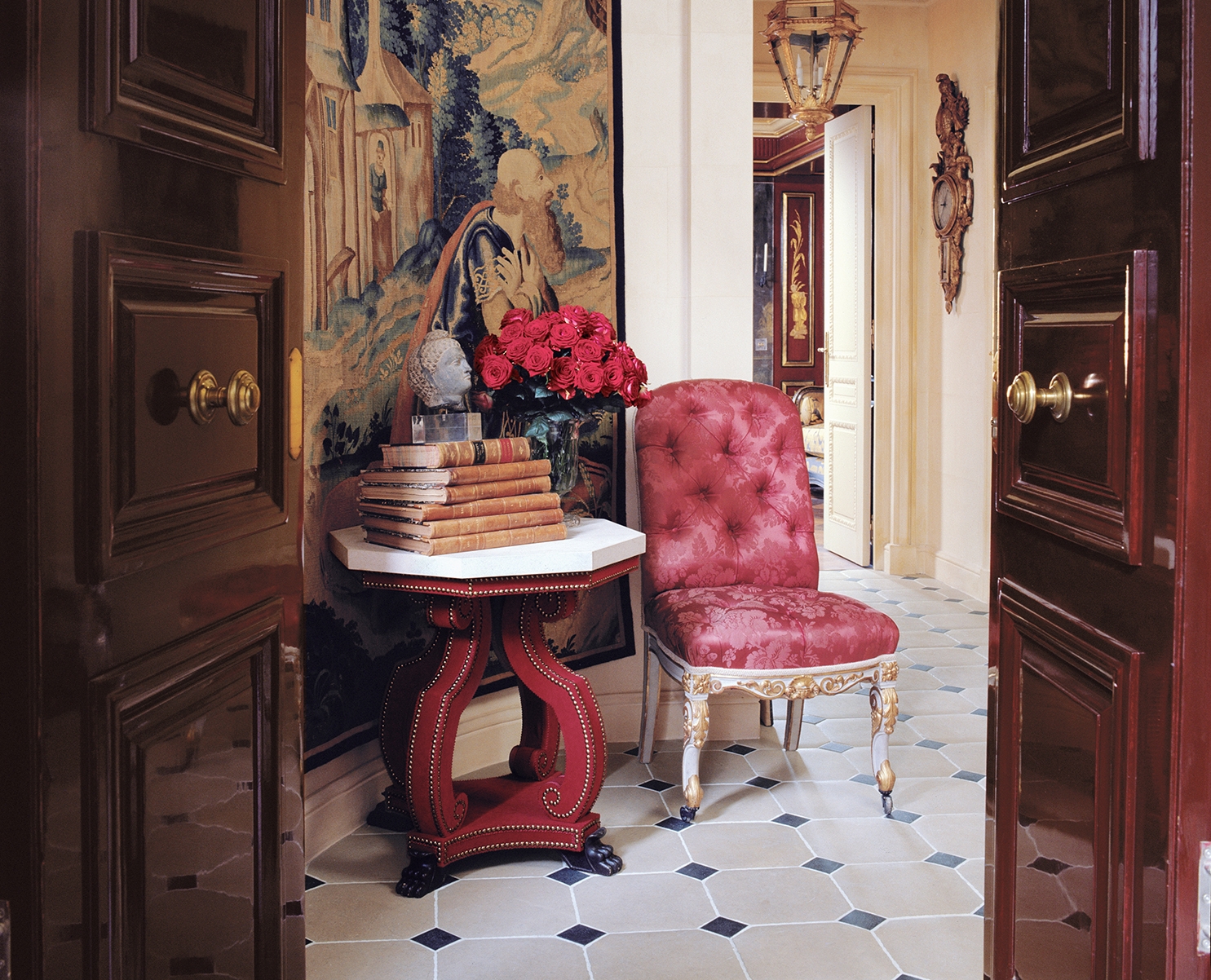
This Parisian hallway illustrates how you can be seduced into believing there is always more and better to come. I gave the space a teasing sense of the riches to be found in the adjoining rooms by way of the combination of a fine Flemish tapestry, delightfully strong red silk antique chair and equally bold contemporary Octagonal Table from my own Velvet Furniture collection.

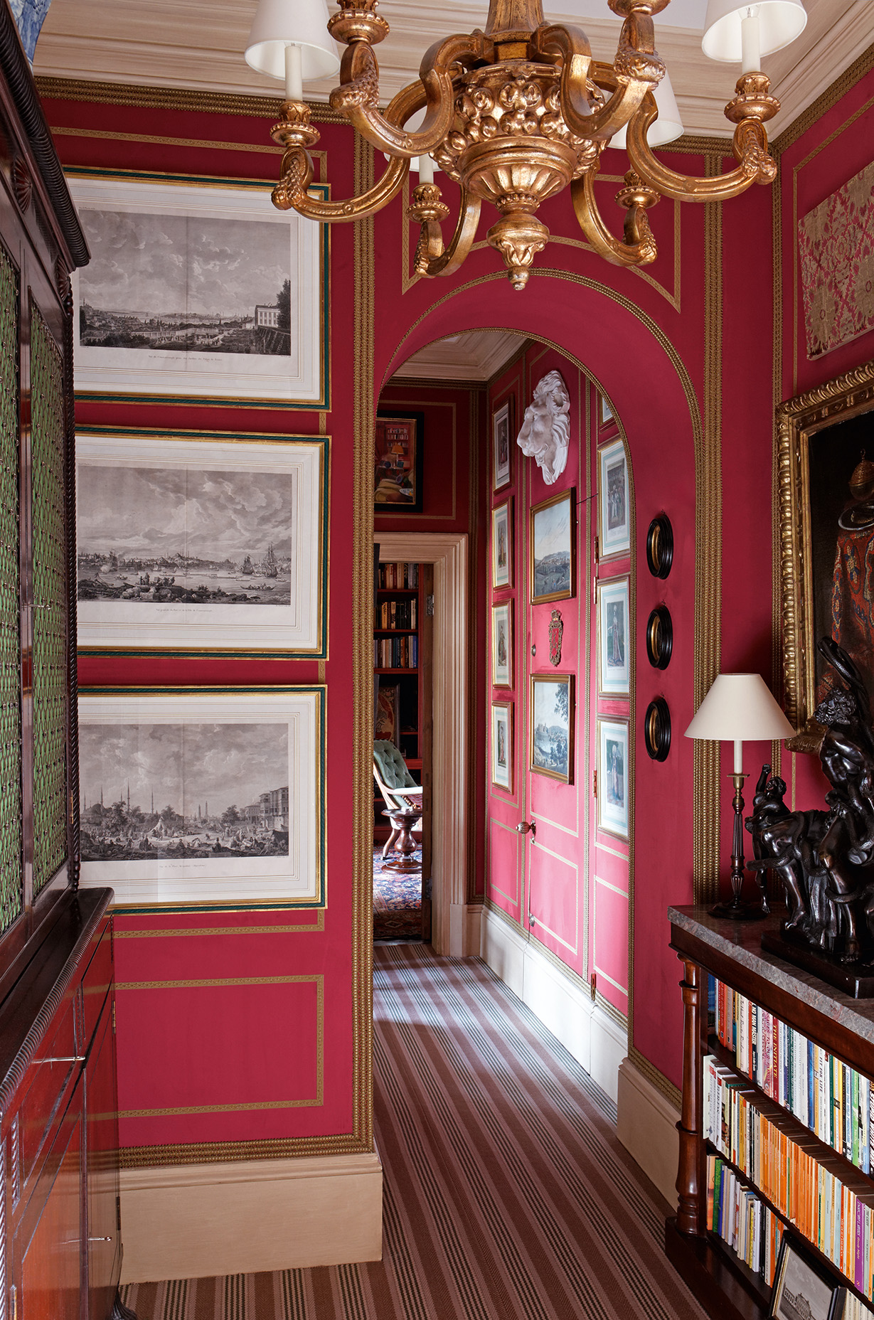
Alidad's London Home
For my own hall in London I set the tone and proportion of the area by treating it as a principle living space, creating a paneled treatment of antique gold braid-work and faux red suede. The unified effect was then doubly enhanced by the extensive number of prints and paintings in conjunction with furniture and other decorative elements that together make the hallway as a whole feel like a series of fascinating interconnecting rooms. The interesting contrast between the busy red walls and striped flatweave carpet helps distract the eye from the fact that this is a very small passageway.

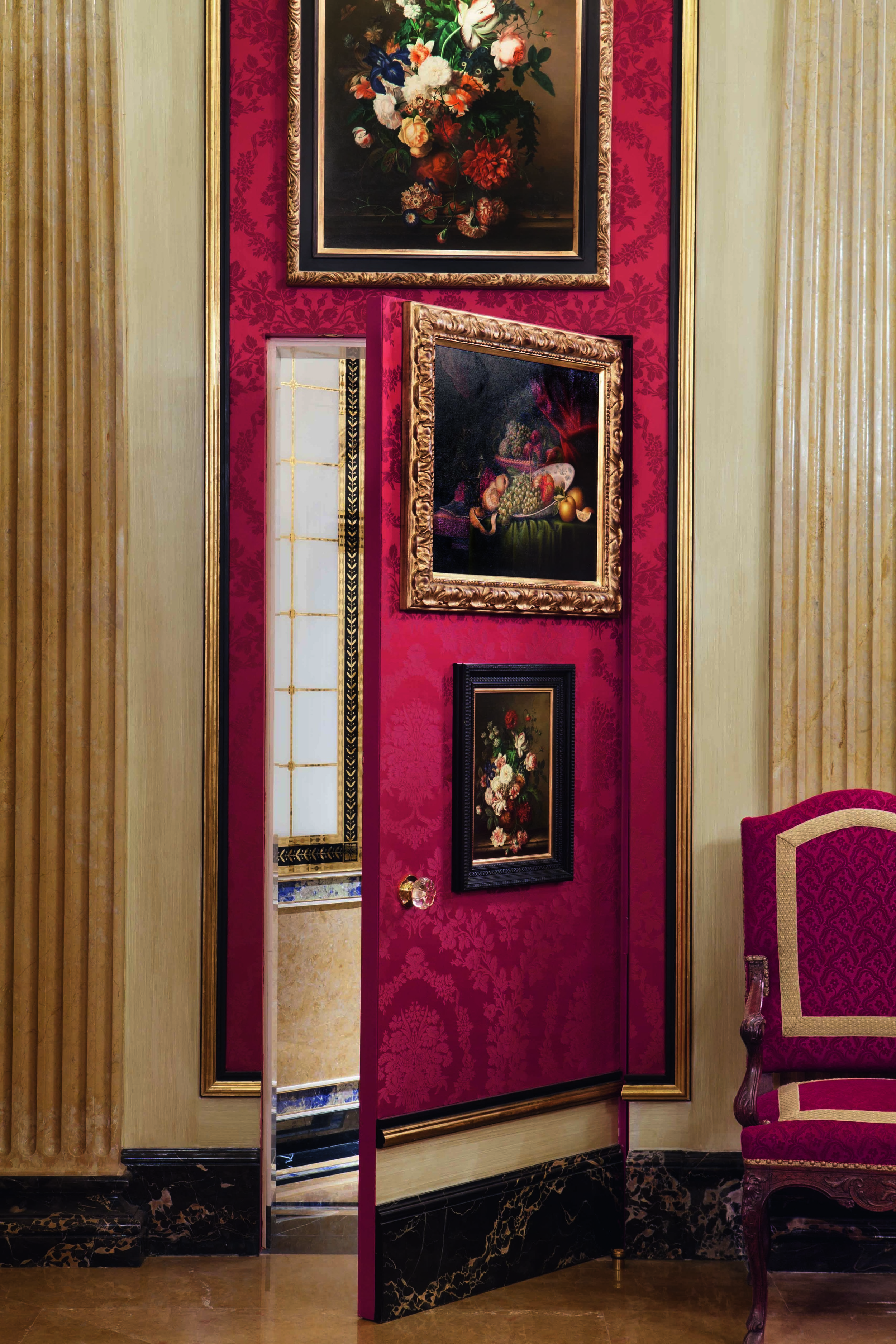
I have a real passion for hidden doorways and secret passageways - here a concealed jib door takes you from a dining room into a glass and marble cloakroom. Every detail aligns so the jib is undetectable.

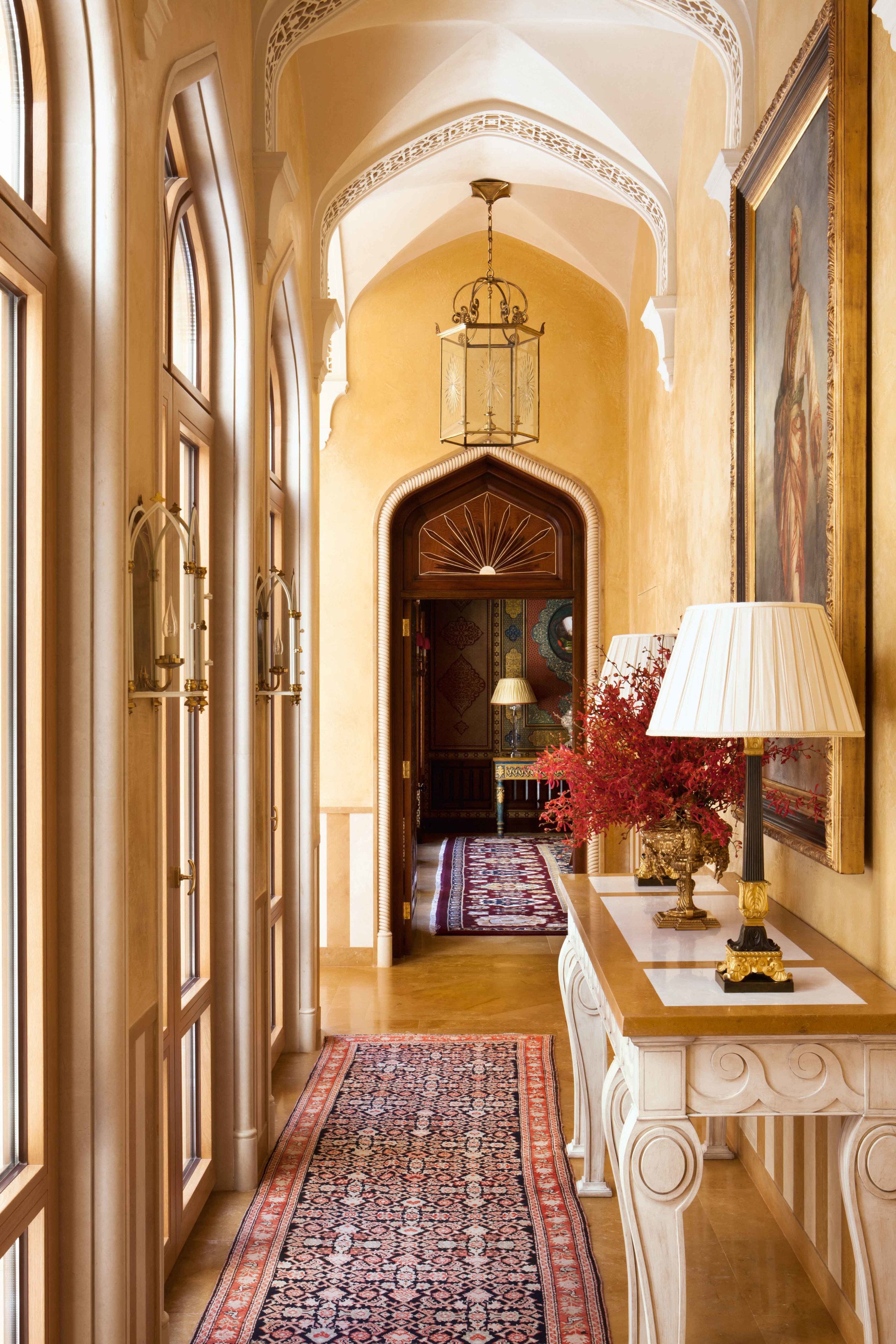
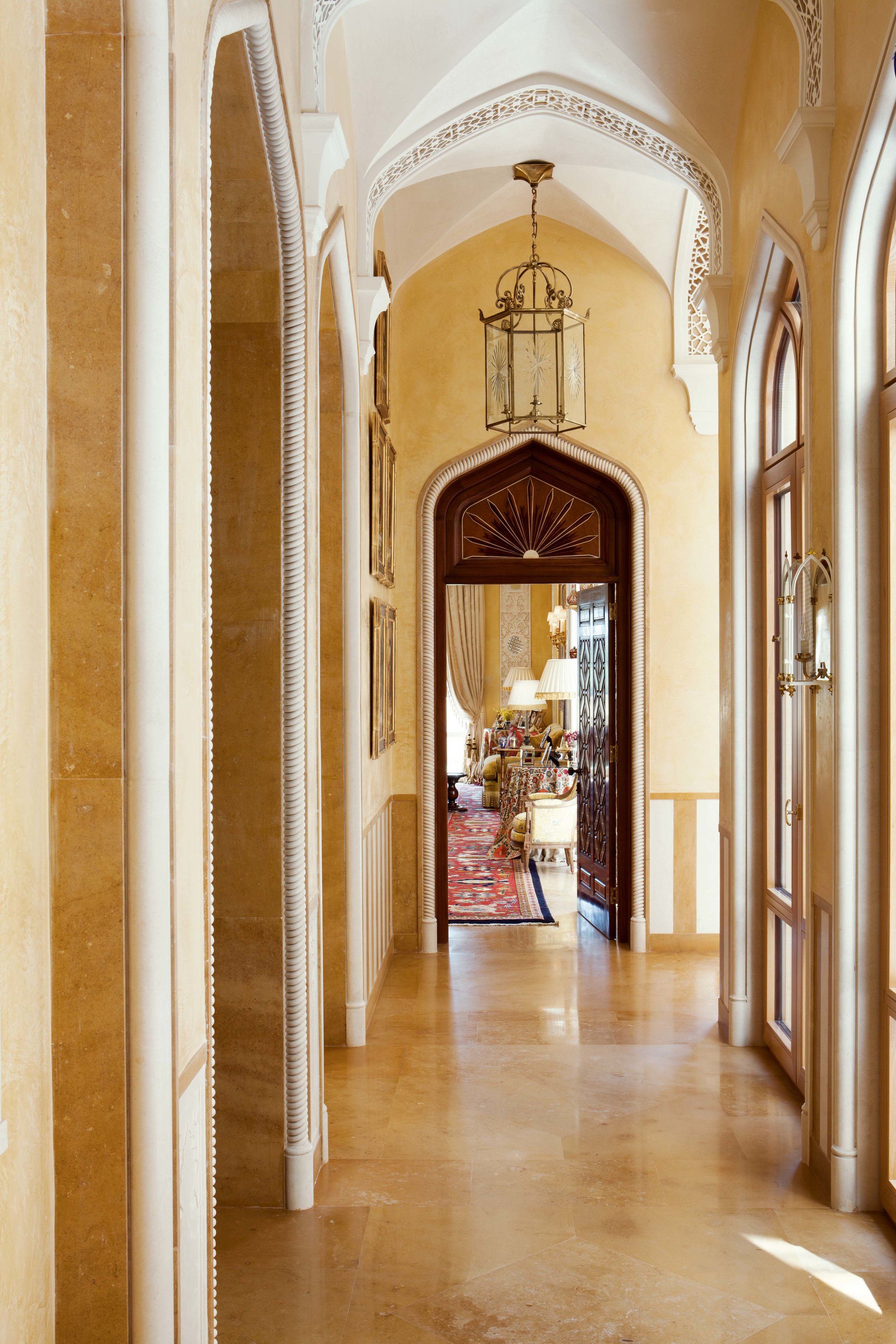
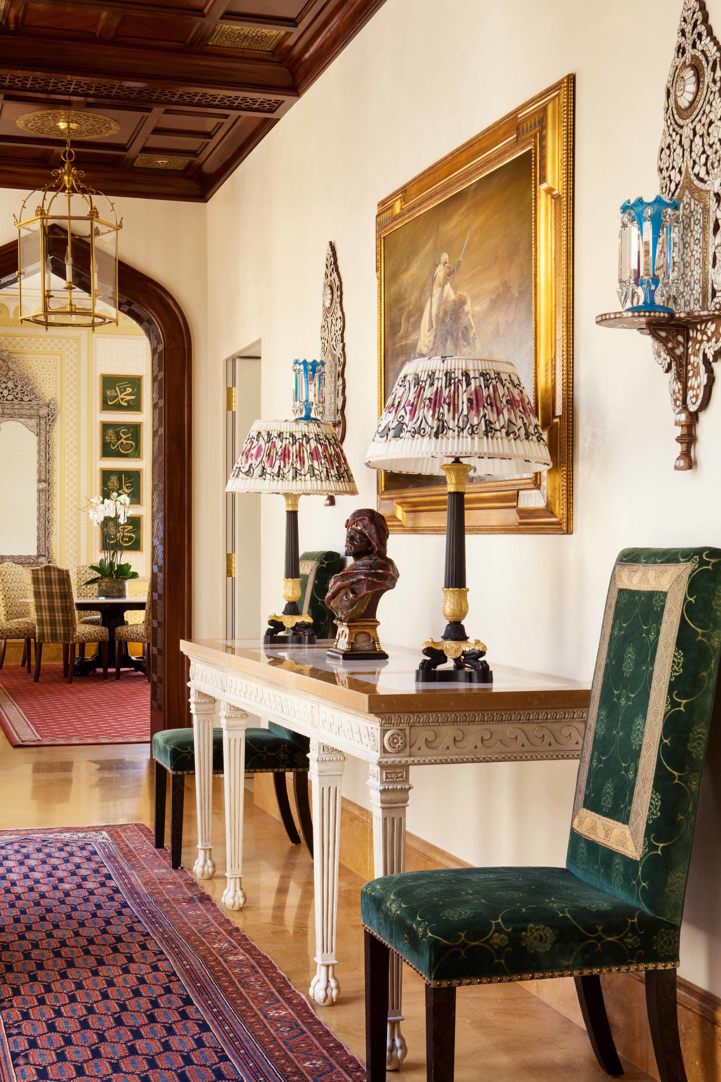
This hallway draws you to exciting and enticing views from whichever way you look as it also faces outward toward a central courtyard. I devised this series of arches with Islamic inspired grillwork and arched doorways with carved stone rope surrounds to make the most of the majestic height of the building. Hanging overscaled gilt lanterns lot into the space also added to the filling-in of the height and helped proportion the whole space gracefully.

The same corridor but looking the opposite direction; even though it is merely an area through which you pass, this corridor is central to the flow of space within the home.

A view of the corridor on the first floor that overlooks the same courtyard

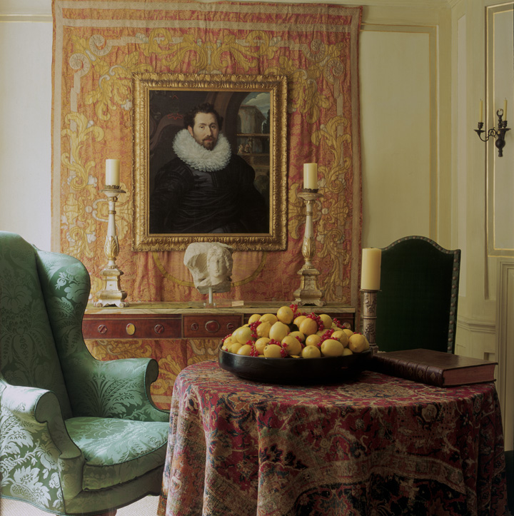
The portrait of this be-reffed seventeenth-century gentleman hangs over an eighteenth-century textile, put with the antique chairs and rare carpet used as a tablecloth, there is a real sense of historical intrigue and authenticity in this hall, all created from scratch in 1999.


In this Lebanese home the design of the hall and staircase had to be both timeless and neutral in order to connect with all the other rooms in the house.
